The Psychological Trick Fast-Food Menu Boards Use to Make You Order More
The line between “quick bite” and “wow, that escalated” often happens somewhere between the door and the counter. You’ve walked into the diner thinking about a basic burger, yet by the time the tray lands on the table, there is a combo, a size upgrade, and maybe an extra side that sounded too convenient to skip. That shift rarely comes from a pushy cashier.
The real action happens on the glowing menu board that meets tired, hungry eyes and quietly steers them toward bigger checks. Instead of asking someone to weigh dozens of options, the board presents what feels like an obvious, low-effort choice, built around a very simple psychological play: guide the gaze, narrow the decisions, and make the “yes” feel easy.
How Menu Boards Take Control
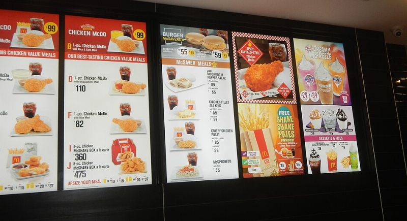
Image via Wikimedia Commons/Judgefloro
Eye-tracking research on menus shows that people do not read them line by line like a book. Attention jumps first to a “golden triangle” area: the middle, top right, and top left, which pull in the most visual focus. That prime territory becomes perfect real estate for high-profit items and meal deals, while less important items sit in quieter zones that rarely get much attention. Studies on menu layout suggest that highlighting key dishes in those focal areas can lift sales by up to 15 percent because guests land on profitable items sooner and stop searching.
Fast-food brands lean into that pattern on digital boards. They keep categories lean because research tied to Bournemouth University’s work shows that around six choices per section feels like “enough” in a quick-service setting, while longer lists start to feel confusing. Short lists grouped under big visual anchors pull hungry people into one narrow slice of the board instead of forcing a full scan of every option. Digital signage companies now openly talk about using eye-tracking data to place categories with the best margins into those hot zones on drive-thru screens, then letting animation, color, and movement keep attention there. When someone glances up, the first clear thing they see is rarely a plain hamburger. It is a prominent combo image that makes everything else feel like a downgrade.
The Combo Trap That Feels Like Help
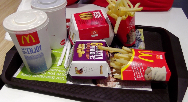
Image via Wikimedia Commons/DAVID HOLT
Once the board has pulled eyes into that triangle, the next move kicks in. Instead of asking a person to build a meal detail by detail, fast-food chains present pre-built bundles as a mental shortcut. A set meal with a main, fries, and a drink appears in that focal area with a big photo and a simple price, while the unbundled items sit in smaller text off to the side.
Behavioral research on choice overload and defaults lines up with this approach: when people feel rushed or overloaded, they gravitate toward options that look like the “standard” choice, especially if a price anchor or larger platter sits nearby to make the main combo look reasonable.
Digitally Steering Customer Choices
Digital boards take that even further. Operators can schedule different layouts by time of day, pushing breakfast combos in the center during the morning rush, then shifting to family bundles or premium burgers during dinner. Industry reports on digital drive-thru systems point out that these boards cut decision time by almost 10 percent in some chains and consistently raise average order values because they can spotlight add-ons and limited-time items right in that visual hot zone.
The result feels like kindness: the board “helps” pick a meal and removes the awkward pause at the counter. In reality, the main psychological trick is very precise. The board shapes the path eyes take, keeps the number of realistic choices low, and frames a fuller, more expensive order as the path of least resistance.